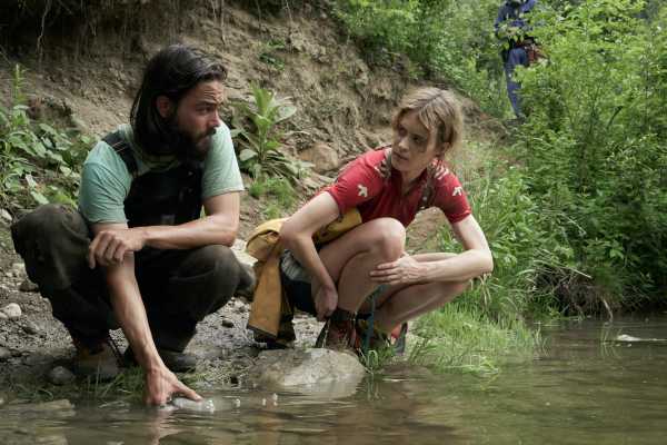
When thinking about how to introduce viewers to the world of HBO Max’s Station Eleven, the show’s production team decided to flip the usual script: The present would feel like the future, and the future would feel like the past.
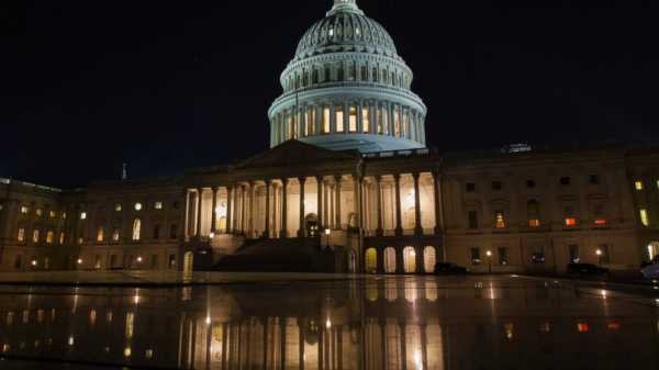
“We chose a lot of locations that had artificial lighting, subway stations, a theater, even the streets at night. Everything has this stark, manmade aesthetic,” cinematographer Christian Sprenger said. “We intended to let that be what the sci-fi future aesthetic normally feels like. And when you jump forward to the future, that almost feels like 200 years ago.”
That imagined future is lush and green and beautiful. It’s an iconoclastic choice for a post-apocalyptic tale. The first episode of Station Eleven drops viewers in a now-familiar fictional setting: The world is ending, and a handful of characters are trying to navigate that fact. The episode is mostly set in our present-day world, in a snowy Chicago that is about to be devastated by the deadly Georgia Flu. The story takes place over a few hours at night, and the images are stark and white, snow everywhere.
Related
Station Eleven made me want to live in the post-apocalypse
But look more closely and you’ll see the episode makes distinctive use of color. Christmas lights twinkle, and the whiteness of the snow is so, so white. A young girl wears a pink jacket over a cream-colored dress. The inside of a subway train features brief, bright pops of color.
This premiere episode is directed by Hiro Murai, one of TV’s best visual stylists working right now, and finding colors at the end of the world turns out to be the overriding philosophy of the series, which captures the strangely hopeful tone of the Emily St. John Mandel novel the show is based on. Reds, blues, and greens are everywhere, and the producers tweaked the images to be more colorful in post-production, where so many post-apocalyptic tales would tweak them to have less color.
“In many ways, we were trying to invert the post-apocalyptic genre,” said Station Eleven creator and showrunner Patrick Somerville. “Hiro always said he wanted to be there when we were talking about year 20 [after the plague that kills most of humanity]. Quiet, big, expansive, beautiful, green. Not destroyed. Just still.”
Why are so many movies and TV shows so drab?
In the 21st century, the color gray leads the way for far too many movies and TV shows. Big and bold colors aren’t a thing of the past, but they’ve fallen out of favor. Why did this happen? And what value does color add to filmmaking anyway?
The end of the premiere sets up that visual idea beautifully. The episode leaps forward 20 years for a very brief shot set in the post-apocalypse, where everything is lush and green. That tiny amount of footage ended up being key to holding together a massive production that filmed just two episodes (the first and third), both of which were largely set in the pre-apocalypse, before Covid-19 forced an extended shutdown onto the production. That tiny snippet of footage of the post-apocalypse was shot by the team of Helen Shaver and Daniel Grant. Sprenger, who served as cinematographer for the episodes shot before the shutdown and established the color palette of the series, then digitally tinkered with the color in post-production. It became key to everything shot after the shutdown, where Steve Cosens served as cinematographer.
“That moment of Mackenzie [Davis, the series’ star] in the sand trap at the end of episode one meant that Christian, who was the original conceiver of the before and after, did the color timing of that scene. He popped the greens in the scrub and other plans. There’s that crazy blue sky, and then Mackenzie has red and blue on. Christian just popped all those colors for about 15 seconds in episode one, and it became a guide for Steve Cosens for all of year 20,” Somerville said.
And in contrast to most stories set in post-apocalyptic or dystopian futures, Station Eleven actually deemphasized color in scenes set before everybody died. Sprenger said that arose naturally from the design choices made for the post-apocalyptic scenes.
“Year 20 is very naturally lit with lots of bright sunlight and lots of colorful greens and flora and lots of saturation. We wanted that world to feel welcoming, and we wanted to push against that concept of Cormac McCarthy’s [The Road’s] very gross, dirty, almost monochromatic future, that sad apocalypse aesthetic,” Sprenger said. “Where that led us was that year zero, the world we’re currently living in, wanted to feel a little bit more subdued and slightly desaturated.”

Color is also used throughout the series for storytelling purposes. The color red sets the main character, Kirsten, apart from others within the show. It nods both to a violent militia known as the Red Bandanas (mostly heard and not seen over the course of the show) and to the days she spent early in the apocalypse in an apartment with two brothers. As you can see in the image above, that apartment was streaked with reds.
But the image that leads this article also features a pale sea green, which the production used as the color of a mysterious organization whose true plans become evident throughout the course of the show. Thus, Station Eleven could use that sea green to emotionally link certain characters — often just characters who would flirt with joining the movement — to said organization. It could also pop that color into the background of scenes so your subconscious would still sense the presence of the group, even if nobody from said group was around.
Retaining a colorful look for the scenes set in year 20 could be challenging for the series’ designers, who needed to create clothes and sets that believably mimicked human beings’ scavenging items out of the wreckage, without sacrificing the vibrant color schemes. (In one scene, a character memorably wears an outfit made of soda bottles, for instance.) Costume designer Helen Huang says she used lots of athletic wear, which could retain at least some color.
“You could sand it to obliteration and it still looks like what it is. The color is still very strong. We tried to overdye as many things as possible, so they retain a lot of that color,” Huang said. “We had our ager-dyers, paint over everything very strategically. It keeps a color but creates sort of a sun-faded look. We did cheat how dirty some things are to push back some of the color to retain its original potency.”
And once it came time to digitally tweak the series’ color scheme, Station Eleven subtly used the desaturation common in post-apocalyptic stories for the scenes set right now and in the immediate aftermath of the Georgia Flu, in contrast to the hyper-saturation of year 20.
“Desaturation to me felt a little bit like an overcast before and after a storm. Having that feeling helped tell what people were feeling just as a pandemic hit, and they’re realizing they’ve lost family members,” said Gina Gonzalez, the series’ post-production supervisor, who worked closely with the digital color team. “Then in year 20, we have these artists who are remembering what they loved, and trying to make art of what’s left to them and doing a good job of it. So beauty is important.”
After all, if you suddenly removed everyone from our present moment, there would still be so much color, argues Huang.
“A large part of this project is about optimism and memory. Those two things also spark color, because if you look at our world as it is now, if you took away all the people in it, it’s full of color. It’s full of graphics. It’s a memory of our civilization,” she said. “It creates this world that’s separate from all the other language of the post-apocalyptic world that’s out there.”
Station Eleven is far from the only post-apocalyptic movie or TV show to embrace a color palette that differs from the usual bleak greys and blacks. Mad Max: Fury Road, for instance, is full of crisp blues and burnt yellows, highlighting its desert setting, and other post-apocalyptic stories like I Am Legend and The Walking Dead have been set in worlds where greenery has overtaken what once were human spaces.
But what sets Station Eleven apart is its willingness to push those vibrant colors to an extreme. Every time the series drops us into a world where humanity is rebuilding, despite the devastation of the Georgia Flu, that world feels almost inviting. It’s not a suggestion that we should be hoping the end of the world arrives, but it does offer the promise that even after the end of everything, people will keep finding ways to care for each other. That optimistic vibe wouldn’t work without the warm colors of the series’ visuals, so the show’s slightly idiosyncratic choices add up to something unlike any other show out there.
“This show was too complicated emotionally to not have color play a huge role,” Somerville said.
Update: The piece has been updated to include a more thorough explanation of the shooting of the short snippet of footage at the end of the show’s first episode.
Will you support Vox’s explanatory journalism?
Millions turn to Vox to understand what’s happening in the news. Our mission has never been more vital than it is in this moment: to empower through understanding. Financial contributions from our readers are a critical part of supporting our resource-intensive work and help us keep our journalism free for all. Please consider making a contribution to Vox today to help us keep our work free for all.
Sourse: vox.com


