We’ve known for decades now that there is widespread variation in what different hospitals charge for the same medical procedures. Study after study confirms this finding (one of my favorite studies shows that, in California, an appendectomy can cost anywhere between $1,529 and $186,955 depending on where it was performed).
But a new paper from economists Zack Cooper, Stuart Craig, Martin Gaynor, and John Van Reenen sheds light on another fascinating type of variation: price differences within a single hospital.
Their research is the first I’ve seen that shows insurers pay different prices for the same procedure at the same hospital.
vox-mark
VoxCare
Subscribe
By signing up, you agree to our Privacy Policy and European users agree to the data transfer policy.
For more newsletters, check out our newsletters page.
This new study takes focuses uses a massive data set from the Health Care Cost Institute, which has price data from insurance heavyweights like Aetna, UnitedHealth, and Humana. All told, this data set covers 28 percent of the employer-sponsored insurance market. What’s more, it covers what these major insurers paid for every doctor visit or hospital stay that these patients had in recent years.
This allows them to look at what different insurers pay for certain, basic procedures. One they focus on is an MRI scan of a lower limb.
Hospitals presumably use the same MRI scanner for different patients. They don’t typically have, for example, one scanner for Humana patients and another for their Aetna customers.
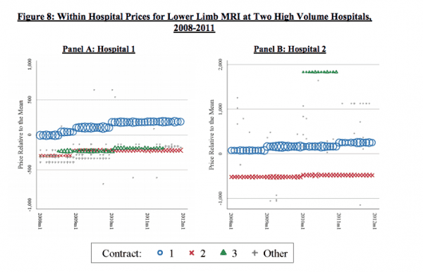
So, it stands to reason that the service provided is really similar, if not identical. Even so, it turns out the price for a lower-limb MRI varies a lot within a given hospital.
All told, this paper estimates that this within-hospital price variation is responsible for about one-fifth of all price variation in the United States.
”That there is such substantial variation in prices for plausibly undifferentiated procedures such as lower limb MRIs within hospitals suggests that the relative bargaining power of insurers with hospitals can strongly influence price levels,” the paper argues.
Here’s what that looks like in graph form, with data from a few of the larger hospitals in the paper’s data set.

“The figure clearly demonstrates that there is significant variation in MRI prices within hospitals at single points in time,” the authors write. “For example, in January 2011, the ratio of the price of the highest volume contract (blue circles) to the price of the second highest volume contract (green triangles) is 1.39 at Hospital A and 1.65 at Hospital B.”
The theory that the researchers put forward — and a theory I find compelling — is that these prices likely reflect different insurers’ market clout. An insurance plan with lots of members can demand lower prices; they’re essentially going to Costco and buying in bulk. But a smaller insurance plan with fewer members doesn’t have that kind of leverage, and gets stuck with higher prices as a result.
Studying these type of prices can be pretty tough. Hospitals and insurers often keep these fees secret — and even with the data set that these researchers use, you can’t see which insurers are paying which prices; all the data remains anonymous. Still, I found this to be a revealing look into what really drives health care pricing in the United States and hope to see more research like it in the future.
This story appears in VoxCare, a newsletter from Vox on the latest twists and turns in America’s health care debate. Sign up to get VoxCare in your inbox along with more health care stats and news.
Join the conversation
Are you interested in more discussions around health care policy? Join our Facebook community for conversation and updates.
Sourse: vox.com


