Save this storySave this storySave this storySave this story
When the heat of summer sets in, those of us who yearn to get to the shore don’t often think of ourselves as part of the herd. Yet the scene in Peter de Sève’s new cover for the July 24, 2023, issue renders that experience recognizable: rushing to the beach in July will often land us in the midst of a boisterous army of umbrella- and picnic-wielding beachgoers, like lemmings eager to jump in the water. I talked to the artist about what fuels his urge to draw and bring a menagerie of characters to life.
What made you think of lemmings for a summer cover?
I’ve always been a little obsessed with drawing animals, and lemmings are no exception. In fact, as teen-agers, my friend Jon Victor and I collaborated on a comic strip called “Lemmings,” which invariably consisted of a lemming standing on the edge of a cliff deliberating some kind of existential dilemma—to jump or not to jump. We never made a dime off of it, but the characters were a big hit with my high-school classmates.
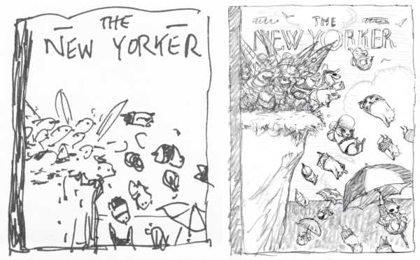
De Sève jots down his ideas for covers in quick doodles and builds up the finishes.
You work in animation as well as print illustration. How do the creative processes differ for you?
While my work in illustration and animation are related, they seem to utilize two slightly different parts of my brain. For the print work, the images have to be carefully composed to tell my joke or story in just the way I want the viewer to take it in. On top of that, almost every one of my covers is done in watercolor, which for me is not exactly the most spontaneous medium. I build up my washes of color gradually and simultaneously refine the line work with a brush and ink until I feel it’s finished.
On the other hand, my character-design work for animation is always done in a very loose, off-the-cuff style. I often begin with just an eyeball and see where it takes me. It’s a much more instinctive approach than my finished illustration work, but I enjoy doing both.
A book collection of your images is coming this fall; you are also going to have an exhibit at the Philippe Labaune Gallery, in October. Is the selection process different for each?
It’s a hard choice every step of the way, and the selection process, whether choosing pictures to display in a gallery or choosing pictures for a book, is heart-wrenching. The gallery may even be more difficult. Not everything looks good on a wall, and I want to show as many aspects of my work as possible; at the same time, we only have a limited amount of wall space to do it in.
You collect other artists’ work. Do you think drawings and illustrations have the place they deserve in the art world?
I continue to be an avid collector of original art, especially illustrators from the early twentieth century. To me, the works are treasures, especially because they are created by hand, which is becoming rarer and rarer in this digital age. Though I don’t think this kind of art work has gained the respect it deserves, I have a feeling it will become more valuable as it continues to disappear.
For more covers about animals in the summer, see below:
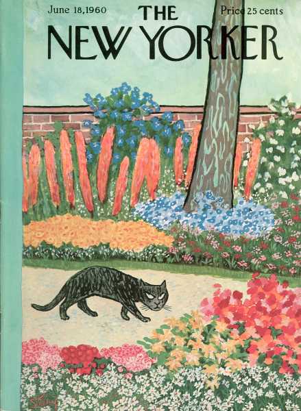
“June 18, 1960,” by William Steig
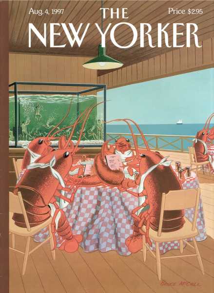
“Lobsterman’s Special,” by Bruce McCall

“Off the Leash,” by Mark Ulriksen
Find de Sève’s covers, cartoons, and more at the Condé Nast Store.
Sourse: newyorker.com
