Save this storySave this storySave this storySave this story
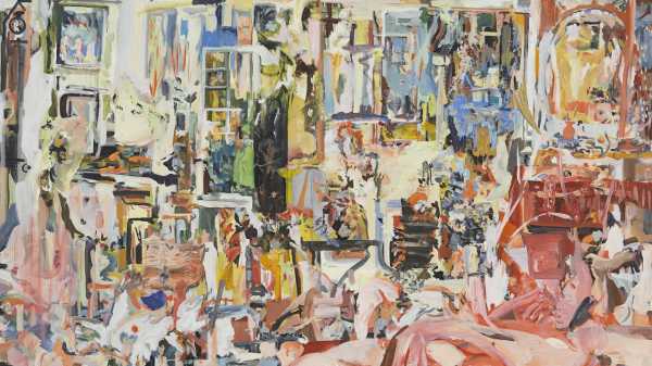
Cecily Brown’s art makes me feel like I’m trapped in a “Twilight Zone” episode, getting my ironic comeuppance. Everything I thought I loved in a painting—rich color, fleshy figuration, slithery abstraction, dense, macabre compositions à la Bruegel and Soutine—gets chucked into the meat grinder of her style and comes out harder to swallow. In her mid-career survey at the Met, “Cecily Brown: Death and the Maid,” comprising some four dozen works made between 1997 and 2022, you will find enough tasty morsels to confirm that she’s a formidable artist. You will also find a surprising number of images that seem muddled or distracted, as though beginning again with each brushstroke. Good abstraction has something inevitable about it—look hard enough and you find the hidden anatomy holding things together. The longer I spend with “BFF” (2006-15), one of Brown’s typically big, robust oil paintings, the more arbitrary its tendrils of red and pink feel. At a glance, it’s a flashy piece of work—but, in the best of Willem de Kooning, to name one of Brown’s heroes, the first glance is only the beginning. In too many of Brown’s paintings, it’s the main course.
Let’s take a step back, though. Not all the way to Bruegel—just to the nineties, when Brown was a young graduate of the Slade School of Fine Art, in London, and English art was in the middle of a renaissance. It was a time of queasy, braying excess, the decade of Marc Quinn’s frozen blood sculptures, Tracey Emin’s sweat-soaked bed, and Damien Hirst’s rotting cow head. What did Brown’s paintings have in common with this stuff? A gamy, distinctly English odor, first of all: her breakthrough show, which opened in 1997, not long after she’d moved to New York, featured images of rabbits breeding, bleeding, or maybe both. Second, an intuition that gallerygoers love a freakshow. The Met exhibition, organized by Ian Alteveer, stresses Brown’s relationship with the vanitas, still life, and memento mori genres: dour imagery of mirrors, fruits, and skulls, meant to remind the viewer that death always gets the last word. I’ve heard grumbles that this is too narrow a subject to do justice to Brown, though it brings out the lively ghoulishness that’s one of her strengths. Buried in her abstractions, one finds dead animals, rotten teeth, and squirming bodies. These images are often creepy but never moralistic; there’s a kind of sensuality in their shock value, so that what at first looks like a warning comes to feel like an invitation.
Is it a compliment to say that Brown is trying to do the impossible? Her art seems to be going for a blend of fiery Abstract Expressionism and cool, eerie appropriations of her European forebears. Part of the appeal of this kind of work, at least for critics, is that it wears its allusions on its sleeve—“Father of the Bride” (1999), for example, makes no secret of its de Kooning debts, and the gross little mouth in “Untitled (Vanity)” (2005) is pure Francis Bacon. (The Bacon connection runs deep; in her twenties, Brown learned that her biological father was the critic David Sylvester, an early champion of Bacon. Let the psychoanalyzing begin.) There’s nothing wrong with ostentatious referencing, and plenty of great art flits between abstraction and figuration; the problem arises when Brown has to reconcile the two modes. Most of the time, she can’t. In the enormous, Bruegel-drunk “Carnival and Lent” (2006-8), bodies and blotches grind against each other, dulling whatever edge they might have had on their own. There are too many bright, aimless patches of pink and peach between the random jolts of faces and buildings—it all amounts to a bunch of sparks pretending to be an explosion.
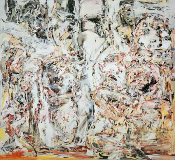
“Father of the Bride,” 1999.Art work © Cecily Brown / Courtesy Metropolitan Museum of Art
But the most convincing argument for why this painting doesn’t quite work comes from the painter herself. In the exhibition catalogue, there’s a fascinating conversation between Brown and the curator Adam Eaker, during which she rhapsodizes about Soutine’s “Still Life with Rayfish,” another major influence. Right away, she nails what’s great about it: the “eye” of the ray is “the portal that pulls you in and the punctuation that freezes the action.” Couldn’t have put it better myself—Soutine knew how to give even his most chaotic images a center, nudging his viewers from oddity to oddity, so that the horror snuck up on them and never went away. Like a number of Brown’s other big, ambitious works, “Carnival and Lent” wants too much of a good thing: every square inch is a would-be eye begging for attention. Where Soutine subtly guides you, Brown jerks you in a million directions at once.
This explains a lot, beginning with how hard it is to remember what a Brown painting looks like. (Having seen this show three times, I find I can picture scraps but rarely whole dishes—a torso here, a yellow there.) It also explains why the more restrained art on view is the most riveting. “The Only Game in Town” (1998), a twist on the trope of the mirror-gazing woman, respects the old horror-movie principle that monsters are scariest when you don’t see too much of them. The inarguable center of the image is another gruesome mouth, but most of the square footage belongs to a pale, sickly yellow that reinforces the mood without overwhelming it. It’s the most obviously Bacon-esque painting in the show but also one of the most Brownian—for once, she doesn’t seem to be rummaging through a pile of influences. There’s a feeling of frenzied imprisonment, a constant of her best work, as though ninety-five per cent of the composition has been frozen in some nasty, amber-like substance, and soon the other five will be, too.
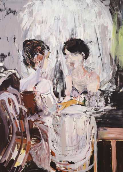
“Untitled (Vanity),” 2005.Art work © Cecily Brown / Courtesy Metropolitan Museum of Art
Even here, though, the entire painting doesn’t stick with you; the mouth does. What George Orwell wrote about Dickens goes double for Brown: she has rotten architecture but wonderful gargoyles. That’s why I tend to prefer her sparser, more soberly arranged compositions—the gargoyles have a better chance of standing out—and why, if given the choice between a big Brown and a small Brown, I’d go for the small stuff every time. It’s tauter, and the colors burn brighter. Consider how much woozy mystery she gets out of the yellowish green in “Maid in a Landscape” (2021): the painting is barely two feet wide but makes most of the larger work in the show feel slight and inconsistent. Epic has nothing to do with size.
In a different sense, of course, Brown’s work has been extraordinarily consistent. From the moment she graduated Slade, she seemed to know what kind of art she wanted to make, and for some time now she’s been one of the world’s highest-selling artists. Painters are generally obliged to wait until they’re dead, or nearly there, to get a show at the Met; Brown is barely in her mid-fifties. Moving forward, sudden changes in style or subject seem unlikely—but, then, success in art is as much about tinkering with the same material as it is about embracing novelty. If this show is any indication, Brown spent a lot of the past three years making smallish, cramped images of people in smallish, cramped spaces. I think they’re fantastic, in a dismal way. Bodies thrash, half-dissolved in joyless chunks of color. These paintings aren’t responses to the pandemic, exactly (Brown was making similar works as early as 2013), but they convey the all-too-familiar sense of choking on your own tail, of life as a dull, piddling drip. Sometimes the most powerful answer to catastrophe is the same old stuff, invigorated by deeper feeling. And sometimes, when an artist spends years trying to do the impossible, she ends up with something pretty damn good. ♦
Sourse: newyorker.com
