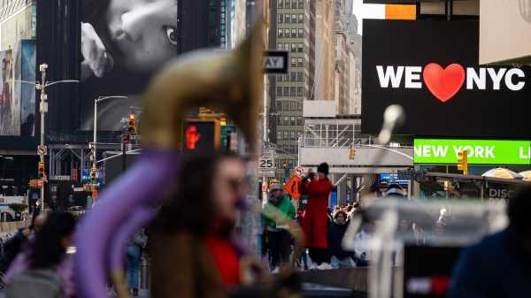
Not since the new money—remember that?—no, not since New Coke—no, not even New Coke—well, then, not since the Dodgers left Brooklyn has any intended innovation met so much appalled resistance as the proposed new logo for post-pandemic New York.
Photograph courtesy New York State Department of Economic Development
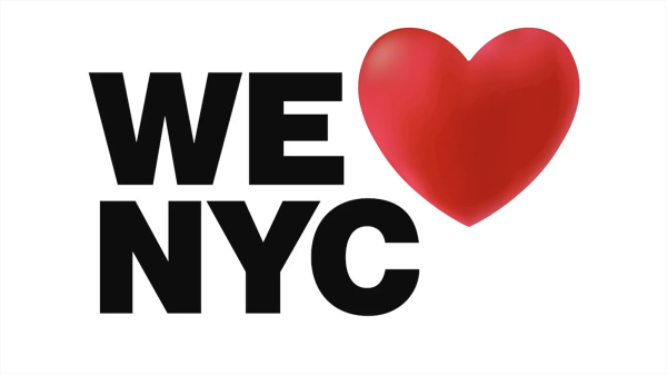
Meant to gently supersede and complement Milton Glaser’s famous mid-seventies logo, which I wrote about and praised this week, it has reeled in hate mail of a kind that not even Donald Trump would seem to deserve from Stormy Daniels. “The original looks like the voice of a city. The new one looks like the voice of an investment bank or possibly a healthcare provider,” one commenter wrote on Twitter. Someone else allowed judiciously that “this sucks on every conceivable level and also on some levels that exist beyond human perception.” And, with perhaps the canniest remark on the design’s yokel-ness, someone else claimed to have seen the new logo wandering around Rockefeller Center asking for the Christmas tree.
What is fascinating to consider, imagining someone a hundred years from now—when the language of graphics has changed enough to make the intricacies of our language opaque—is why we’ve reacted so loudly. This logo is the same idea as Glaser’s after all, very mildly tweaked. (Apparently by one Maryam Banikarim, who had the not-bad-on-the-surface idea of adapting a subway typeface and did this in tandem with a group of civic-business boosters.) So why all the tsuris? Well, first because what Glaser pursued, as I tried to suggest in that lengthier piece, and as he always insisted, was not drawing elegant graphics but thinking in images. His seminal Bob Dylan poster, which once decorated every teen-ager’s bedroom, caught lightning in a bottle: Dylan was in transition from rough-and-tumble early-protest Bob to later and superior Rimbaud-image-mongering Bob. The poster caught that transformation.
Similarly, the original “I❤️NY” logo—even though it was scribbled on the back of an envelope (and was originally, as I noted, intended to indicate the state, though it was quickly subsumed into the town)—worked so beautifully because that heart symbol acted as a hasty synecdoche for love, and this in a pre-emoji age when such rebuses were rarer than they are now. By compressing civic love into a single symbol, the design brilliantly caught the speed and dispatch of our city. The heart was meant just a little ironically, in the same spirit as Detective Kojak’s memorable “Who loves ya, Baby?” of the same period. We don’t have to take the time to say “I love New York” when we can do it in a single sign, because we don’t have the time. The original logo not only advocated for New York; it advocated in a New Yorkish kind of way. (I strongly believe that the now universal “Love you!” phone farewell to friends and family, extending now even to parents, began then—and that I began it—but that is another tale.)
The new logo fails because, instead of summing up an emotion, it belabors an image. “NYC,” though an abbreviation used in official records and sometimes on mail, is unnatural to New Yorkers and calls up no sensitive synecdochic vibrations. We know New York only as New York—the state comes in a sad second in the registry of meaning. “NYC” is like “Avenue of the Americas”—a rebrand used only by out-of-towners. (In an early profile of Donald Trump, in GQ, back in 1984, Trump gave his phony game away when he referred to Sixth Avenue exclusively by its fake name.) “NYC” is going a bridge, or consonant, too far.
And then the addition of a rounded shadow on the design’s heart misses the whole point of the original, which was that it could be devoured at speed and therefore indicated a city speedy in its devourings. The logo in its new form is not extended to a new age, it is merely slowed down as if in old age, and nothing could be worse.
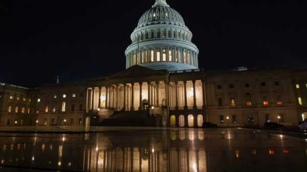
What is easy for the new generation to miss is that the original logo had just a mild undertaste of belligerence to it, like bitters in an Old-Fashioned. At a time when New York was feared and despised and thought to be dying, Glaser’s creation said not merely that one of us loves New York but that we love new York—so fuck you, Mr. President who abandoned the city in a moment of crisis (spurring the famous Daily News headline: “FORD TO CITY: DROP DEAD.”) Youngsters will not credit how depressed and threatened the city felt then, at a time when “Taxi Driver” seemed like “Wonderful Town”—or how much the “I❤️NY” campaign (with its cheering accompanying jingle, written by Steve Karmen) was a startling affirmation. O.K., hate us, but we still have Broadway, the Rockettes, the park, “Saturday Night Live”—we’re still here; all is not lost. Similarly, today we want to affirm that, although a lot of the social fabric of the city has undeniably degraded—too many helpless people on the subway in need of care, and too many rats in the park in need of removal—the core of the city is sound and solid. Those of us who stayed in place in town right through the pandemic, resisting all invitations to escape, Boccaccio-style, to a country house, or to decamp to some other not-New York place, thought afterward of demanding T-shirts that read “We Never Left.”
What we really want in a renewed logo is that properly renewed note of belligerence. Milton Glaser, were he living at this hour, would doubtless have made something a little darker and more aggressive, as he did after 9/11—maybe a new logo using a new emoji and not saying, wistfully, that we still love New York but that, in effect, anyone who doesn’t has something really wrong with them. There was a little bite beneath the old heart. We want to hear it, visually, again. We are renewed more by a snarl than a smile. That’s why we ❤️ New York. ♦
Sourse: newyorker.com