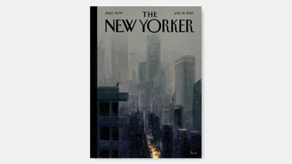
This week’s cover is by Pascal Campion, a French-American illustrator making his début in the magazine. Campion, who lives in California, has worked in the animation industry for more than fifteen years, and he recently sat down with us to talk about his art, his influences, and how he was inspired by New York.
What impressions did you bring back from your first trip to N.Y.C., a couple of years ago?
“Impressions” is a good word—I still have images imprinted in my brain from that trip.
It started out fairly mellow, in White Plains, as I was there for business. I took the train into the city and felt like a kid on his first date. As we got closer and closer, my heart kept beating faster and faster. I remember seeing the first buildings on the outskirts, and being surprised that they looked so much like what I had pictured, though maybe a little bigger. And there were so many people!
I got off at Grand Central Station, and then it was just one huge moment after another: the size of the buildings, the avenues, the parks, the lights in between buildings. I walked up and down Manhattan that day, walked until the sun came down. The city at night was even better. I was so impressed by it that I made a series of images right when I got home.
You were born in New Jersey, grew up in the South of France, and are now settled in Burbank. How did the places you lived influence your work?
I actually have no memories of New Jersey at all—I was a baby when my French parents moved back to France. I always wondered what it looked like; in my mind, New Jersey sounded like an amazing place. Growing up in France, everything “U.S.” was exotic and appealing!
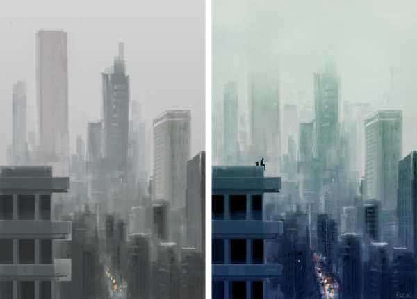
Two preliminary versions of Campion’s image.
I’ve read that you became an artist because your older brother made you copy his comics before you could read them. Were there any French or American comics that inspired you?
I read hundreds, if not thousands, of European and American comics growing up. I was always exposed to a wide variety of art, from French painters like the Impressionists to editorial cartoonists like J. J. Sempé and Cabu. I loved the work of Franquin, as well as the Asterix books, and avidly read Marvel comics published in French magazines. I was always in between two worlds.
You’ve said that you build your images on two axes—first, the space’s architecture and perspective, and then the lighting. Why are these aspects are so important to you?
I’m pretty Cartesian, so I like to build my images on a solid structure. I need to lay out a space of some kind in order to create my pieces. But, once I have that notion of depth on paper, I love to forget about it and just play with light and see what happens. It's amazing how much light adds to our daily lives. We don't always realize it.
Tell us about your practice of doing a sketch every day.
I started doing daily sketches around 2005. At the time, I was working at a game company and doing much more managing that anything else. I felt frustrated that I couldn’t draw. I started coming in earlier in the mornings and doing a drawing before work started. It started out with simple characters on a white background; over the course of a few weeks, it evolved into full stories with backgrounds and lighting. Now there are almost five thousand of them.
See below for more covers depicting the city:
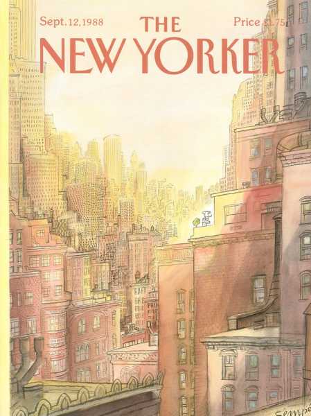
“September 12, 1988,” by J. J. Sempé.
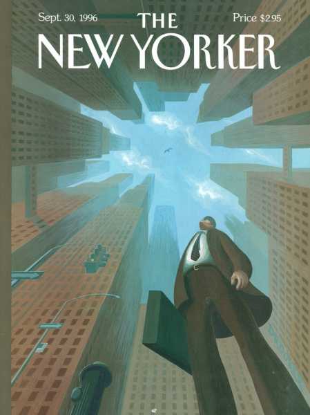
“Upwardly Mobile,” by Eric Drooker.
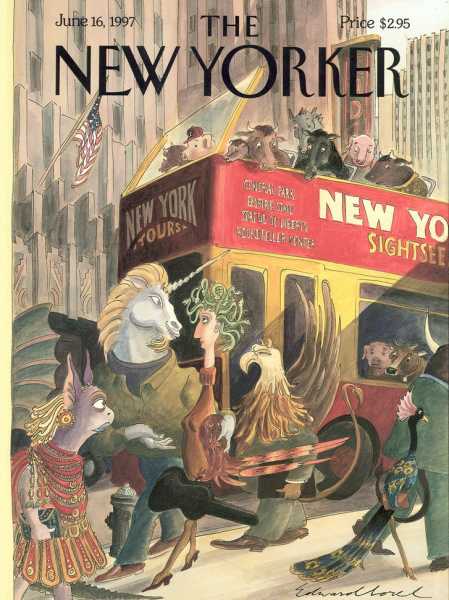
“Walkers and Gawkers,” by Edward Sorel.
Sourse: newyorker.com
