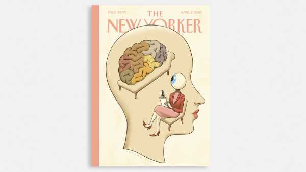
The artist Christoph Niemann’s latest cover, for the Mind Issue, winks at you when it’s displayed on a digital device. Bringing a drawing to life isn’t new for Niemann: in 2014, he drew The New Yorker’s first GIF cover, which saw raindrops slipping down a windshield on a stormy day. Since then, he’s used the cover as a departure point for an interactive tennis match, a virtual forest, and more, each experiment a freshening of the form. Niemann, who’s based in Berlin, recently sat down to discuss his work on adding movement to still images.
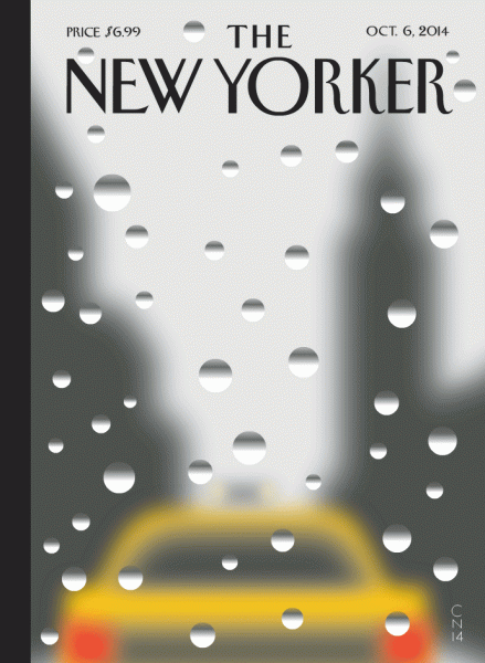
Many of Niemann’s animated covers have been GIFs, with early examples above.


Many of Niemann’s animated covers have been GIFs, with early examples above.
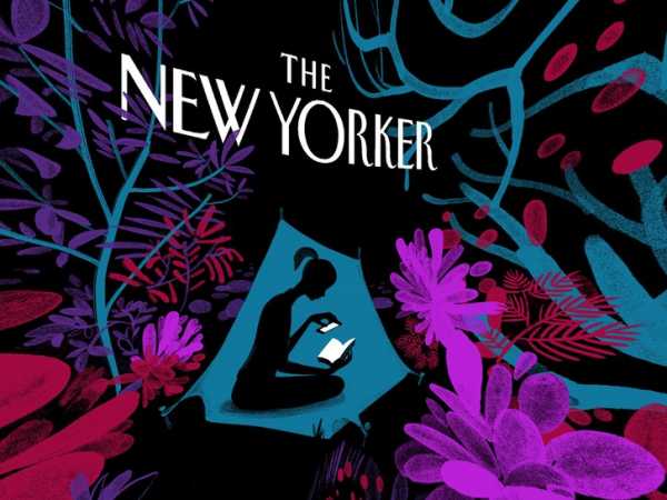
Niemann expanded his “Enchanted Forest” into a three-hundred-and-sixty-degree virtual scene.
What first drew you to animated and interactive elements?
I’m very curious about how they enhance visual concepts. Drawing is usually all about abstraction, limiting choices—a specific angle of a specific scene. An animated or interactive dimension changes that.
When you start drawing, is that potential already in your mind?
Usually, I just focus on the still 2-D image—that’s difficult enough! Once we’ve settled on a concept, I start thinking about interaction. This might slightly alter the style or technique of the illustration but shouldn’t affect the punch of the still drawing. When I draw, I constantly switch between being an artist, who makes marks on paper, and a viewer, who judges whether those marks make any sense. As I draw, I observe, and sometimes I witness a lucky accident that leads to a new direction.
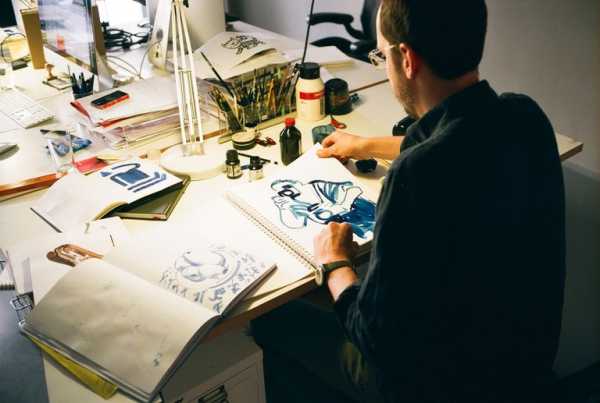
Niemann at his studio in Berlin. “The idea of an augmented or virtual reality is inherent in any drawing,” he says. “If you create a world on paper, you create a window.”
Photograph by Maxime Ballesteros
How do you know that direction is a GIF as opposed to, say, a three-hundred-and-sixty-degree animation?
It all depends on the initial concept. For some images—like the Mind Issue cover—there’s no point in showing a three-hundred-and-sixty-degree image. There’s nothing to see here! With the Fiction Issue, the forest that surrounded the main character lent itself to a virtual-reality animation. I do make a distinction between an animation—a movie with a beginning and an end—and an animated illustration. The latter is usually a loop: part of the fun is that it’s never resolved. Since a New Yorker cover is a single image, that’s often the most natural way of adding movement.
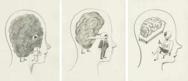
Sketches of the Mind Issue cover, looking for a “lucky accident” in the interaction between eye and brain.
Has the technical work of animation become easier?
I work with extremely talented programmers, but animations take a long time, and if I have to contact a developer for each of the endless tiny variations, a fluid creative process becomes all but impossible. Instead of asking them to execute my ideas, I use their input to develop methods that allow me to experiment. I can only execute fairly simple concepts, but, as often happens with creative endeavors, limitations can be an inspiring source of new inventions.
For more of Niemann’s animated covers, see:
“A Rose”
“Enchanted Forest”
“Coffee Break”
“Rainy Day”
“Serve”
“On the Go”
Sourse: newyorker.com


