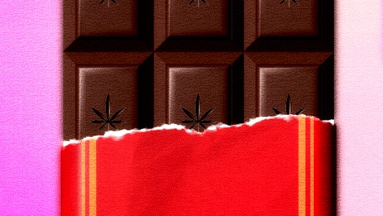
For the past decade, the pinnacle of California package design has been the Apple box, with its minimalist exterior, layers of white-on-white fittings, and glossy tech product encased within. Sleek, seamless, promising you the world—made in China, designed in California—at the swipe of your fingertips. But recently a different industry has taken over innovation in hand-held products. An industry interested in local. An industry interested in social. An industry interested in taking you on a surprisingly autobiographical trip.
I speak of cannabis, now legal for recreational use in twenty-one states and D.C. The cultural handoff from high tech to high times seems just right for our not quite post-pandemic moment, with its halting return to IRL encounters, its panoply of stressors, and its personal branding of everything. Growing the cannabis market, however, has required repackaging a product that originally came in generic plastic bags and rolling papers, in varieties that were named for a location, an aroma, or an in-joke. Things have become a little more complicated now that cannabis is legit and you are selling a product in a palm-size package, from dispensaries that cater to millions of newbies. (The California cannabis market hit $5.3 billion in 2022, an eight-per-cent decrease from the year before.)
“The brand is primarily expressed through packaging. The product becomes the billboard,” Elizabeth Goodspeed, a designer and critic who helped create the Op-art-inspired packaging for the company Melted, said. Cannabis gummies are just about the same size as jewelry in a case, and have to take on some of the glitter of precious metals or gems. They also must make themselves look safe for first-timers and the newly curious. According to the analytics firm Headset, the edibles market skews older, but millennials make up the lion’s share of all cannabis consumers. State regulations require clear labelling of THC and CBD content (though the specifics vary around the country), and visibility on the crowded shelves of dispensaries requires big graphics (though not graphics that look like products for kids). “Cannabis can index onto medicine; it can index onto food and beverage; it can index onto alcohol, which allows for a wider range of inspiration and aesthetics,” Goodspeed said. “It’s attainable luxury.” Whatever your hobbies, whatever your personal style, there’s probably an edible that dovetails with it.
“The packaging lends itself to shareability,” Kristi Palmer, a co-founder of the twelve-year-old Kiva Confections, told me, when explaining the decision to switch their Camino line (sample flavors: sparkling pear, wild berry, yuzu lemon) from a soft pouch to a hard tin. “It feels good when you pull it out, like a beautiful bottle of wine or a beautifully plated entrée.” For a bougie mom, edibles feel safe: fruit-flavored and low-dose—and with their THC and CBD levels printed on the package, they take the guesswork out of the experience. The round tins reminded me of the French pastilles that I carried in my backpack in high school; like Orangina soda, a talisman of sophistication in a Doublemint and Mountain Dew world. The gesture of opening the tin and offering one to a friend felt familiar, too. Let’s hang out and get high, but, unlike those high-school experiences of smoking up in the woods, let’s be sophisticated about it, too.
Named for El Camino Real, a historical mission route that runs from San Diego to Sonoma, Kiva’s Camino line comes in sturdy, recyclable metal tins that each feature a dreamy outdoor scene, rendered in graphics with a retro-postcard feel: Joshua trees on the pineapple-habanero flavor, a high-altitude lake on the midnight blueberry. The brand is distributed in ten states, so the company must negotiate a thicket of individual state regulations for the packaging and appearance of controlled substances. These regulations can have a large impact on design: In Colorado, for example, edibles cannot be sold in the shape of humans, animals, or fruits, making them less likely to be confused with non-potent gummies. In California, packages have to be opaque, child-resistant, and resealable—they are tested on children and seniors—but the No. 1 complaint Kiva gets is that the tins are too difficult, rather than too easy, to open.
The packaging of Rose Los Angeles offers the most direct reminder of Apple: the mango gummies come in a rectangular sunshine-yellow box (which exactly matches the color of my iPhone case), adorned with minimalist graphics; the lift-a-flap discovery of the edibles themselves reveals a tiny grid of twenty resinous cubes. “We didn’t want them in a tin; we didn’t want them in a bag, because they all get glopped together,” Scott Barry, Rose’s creative director, said. Although many edibles are made on a production line, Rose initially took a pastry-chef approach, rolling them out on a stainless-steel table and using a confectionery cutter. (This technique was eventually discarded in order to prevent product waste.) “We would watch them get cut into squares and see them in that row on a table.” Barry compares that aesthetic vision, with a laugh, to late-aughts restaurants that got deeply into theatrics and props: “By the time they serve the first dish, your senses are already heightened,” he said. “When you open the box, you think, Oh, I am about to have an experience.”
Other brands get autobiographical. The almost two-year-old company Mesobis, which wins the prize for most glamorous individual candies, has modelled its “gomitas” after Teotihuacán’s Pyramid of the Sun: tiny stepped mounds dusted with chili powder or sugar and sold in tamarind, mango, and açai. The name, and the gummies’ shape, both refer to Mesoamerican civilization, which the founders (originally from Mexico and Brazil) feel has been underrepresented in the market. “People were going to Latin America on vacation, Latin music was exploding on Spotify, tortillas were outselling hot dogs and hamburger buns, but cannabis companies were selling the most obvious caricature of Latin American culture,” the co-founder Nelson Cury told me.
While the product refers to the distant past, the packaging—a resealable pouch—refers to more recent design history: Central and South America’s superlative roster of Brutalist buildings. Anyone who has spent time on design Instagram can spot the inspiration for the bag colors: the brilliant pinks and yellows of the Mexican architect Luis Barragán. Meanwhile, the bold curves of the brand’s custom font, created by the Mexico City graphic designer Andrés Higueros, simultaneously reference Mayan symbols and the kind of simplified shapes pressed into the poured concrete walls of Brutalist structures like El Banco de Guatemala.
Sundae School—a Korean American streetwear and cannabis company—has an equally elaborate origin story, albeit one based on food rather than architecture: the co-founder and creative director, Dae Lim, based the flavor of his first boba gummies on the Sunday youth ritual of bubble tea after church. The flower shape of each gummy mimics the hibiscus symbol of the Korean government, a joking reference to South Korea’s anti-cannabis policies, and the ddul character printed atop each edible is, according to Lim, “Gen Z slang for weed.” Sundae School’s slide-top tins—designed, along with all the company’s other branding, by Audrey Bark and Corinne Ang—are also an homage to the childhood favorites 사랑의 캔디 (Candy of Love), the Jolly Ranchers of South Korea. “You would collect those boxes, put stickers in them,” Lim said. “I liked the idea of being able to reuse it,” whether as a stash box or for something more innocent. The package may be a billboard, but so, too, is TikTok, where most of these brands can art-direct their product in a manner impossible in real life. Sundae School got a million views for a TikTok in which disembodied hands with a metallic-pink mani unbox Mochi gummies under the legend “pov: u find the cutest lil gummies with the cutest lil packaging.” (The nails match the color of the word “Mochi” on the box, naturally.)
As with viniculture and modernist cuisine, makers also wanted to tell me about their edibles’ terroir: Rose’s co-founder Nathan Cozzolino boasted about using key ingredients that are within a car drive of San Francisco; if the brand succeeds in coming to New York in May, we can eventually expect apple and mulberry flavors from fruit gathered upstate.
Raw Garden, a “legacy brand” from California’s medical-cannabis days, held taste tests of its bright, square gummies without cannabis content. “We have more of a traditional candy model,” the co-founder Khalid Al-Naser said. “We focussed on the gummies being satiating, with a lower dose and a bigger unit size.” When you open one of their bags—white, with a ziplock top and oversized photos of produce—there is a distinctive fruity aroma, and the gummies are soft and gemlike, in flavors like Meyer lemon and Bing cherry. “We definitely think about the chaos inside the retail stores,” he added. “I have really leaned into the simplicity of our packaging.” California’s five-year-old recreational market is mature, and very crowded; every brand I spoke to thought that New York State, which opened its first legal dispensary in December, 2022, is likely the next great frontier.
In Los Angeles, many of the dispensaries are well lit, even sunlit, with product in glass vitrines or on blond-wood shelves, and good-looking salespeople who have tattoos, piercings, or killer manicures—or, often, all three. The best of them are happy to lead a slightly dazed middle-aged woman through the forest of dosage, flavors, and delivery methods, as long as she can spit out a few key words, like “chill” and “lightweight.” At Wyllow, where the walls, mirrored and neon-lit, suggest an endless cathedral of cannabis, the saleswoman lifts glass cloches and lets you smell the terpenes. Just like on TikTok, her manicure serves as a polished frame for the palm-size products.
Though it would seem as if newer markets should be rolling out the high-style shops and budtenders, recent experience would indicate that New York has a long way to go to catch up to L.A. When I paid a visit to Housing Works Cannabis Co., situated in a former Gap store near Astor Place, the presentation consisted of a limp display in an el of glass cases, clearly beside the point. Like so many pandemic-punched restaurants, this dispensary was basically just a pickup location, the product placed in discreet brown bags. When I said I was interested in edibles, the clerk offered me a list, no photos, divided by THC content. The brand designers wept. ♦
Sourse: newyorker.com


