When I met Art Spiegelman, some forty years ago, back in the fall of 1976, I was blown away by his enthusiasm for comics. We were hanging out in a group of avant-garde filmmakers that coalesced around the Anthology Film Archives and the Collective for Living Cinema—Art proudly called himself a cartoonist, which stood out in that milieu, where comics weren’t thought of as serious art. He talked fervently about his chosen medium, and gave a series of lectures at the Collective that promised “an idiosyncratic historical and aesthetic overview of an art form.” It seemed like a radical idea. The perception of the medium has changed a lot in the past few decades. Now it’s given serious consideration, and has plenty of fans and fervent readers—still, the most exciting parts of the process of making a comic can be opaque. Learning to look at comics, seeing how a cartoonist builds a narrative with words and pictures, remains as electrifying as when I first discovered it.
Back when I met him, Art was putting together “Breakdowns,” an anthology of the strips that he had published in underground comix in the previous years. Those strips were dazzling examples of formalist works, on par with the work of avant-garde filmmakers or of the French writers I came of age with—including Georges Perec, Nathalie Sarraute, Roland Barthes, and the members of Oulipo—but they were also entertaining and easy to read. Simple on the surface, each page could be peeled like an onion to reveal ever more translucent layers of meaning. One of my favorites was “Don’t Get Around Much Anymore.” I loved its spare black-and-white, Art Deco-inspired look. Reading it felt transporting, like listening to jazz. I knew this artist was something special. (This was before he created the Pulitzer-winning graphic novel “Maus”; also before I married the guy.)
At the time, Art seldom wrote or lectured about his own work. He quoted an aphorism that’s widely misattributed to Abraham Lincoln: “Better to remain silent and be thought a fool than to speak out and remove all doubt.” But when “Breakdowns” was published, in 1977, to a resounding lack of attention, he broke his rule and wrote a straightforward explanation of my favorite one-pager, explaining the techniques he used to create that strip’s powerful moods and metaphors. A new edition of “Breakdowns: Portrait of the Artist as a Young %@&*!” is coming out next month, with the 1977 “Breakdowns” at its center, and “Don’t Get Around Much Anymore” at the center of that. The following is adapted from the new edition.
—Françoise Mouly
“Don’t Get Around Much Anymore,” a Guided Tour by Art Spiegelman (1978)
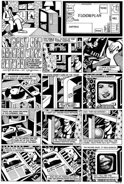
I’ve been told that “Don’t Get Around Much Anymore” is depressing. I don’t see it that way. “DGAMA” is, among other things, a meditation on depression and alienation.
The text was written in a single flash—an excretion into a notebook, not originally conceived as material for a comic strip. Since it is primarily descriptive, it might seem unpromising for a medium noted for frantic action. Perhaps this is what drew me to it. The text afforded me an opportunity to expand on the idea that comics represent time spatially. That is, an interval of time is usually implied between each panel, though they all exist simultaneously on a page. The only motion (the only frantic action) when one reads a comic strip is in the reader’s eyeballs. One is trained to read a comic strip from left to right, top to bottom, one panel at a time. “DGAMA” attempts to derail this training.
I tried to adopt drawing techniques and mannerisms—a style—appropriate to the subject matter. The Rapidograph pen, a tool used for mechanical rendering that creates lines of unvarying width, seemed a good choice, as did the parallel-line shading and general starkness of the black-and-white. I did want something angular about the artwork—a metaphor for feeling “boxed in,” a visual pun on the title, “Don’t Get AROUND Much Anymore.”
The drawing is very diagrammatic. All comic-strip drawings must function as diagrams, simplified picture-words that indicate more than they show. The first two panels, the first row of panels, are diagrams of the rest of the strip—diagrams of diagrams. I often try to synopsize my strips in the first panel or so before the beginning. They function like “splash” panels in more traditional comics—the lead panel that depicts the theme or high point of the action to follow.
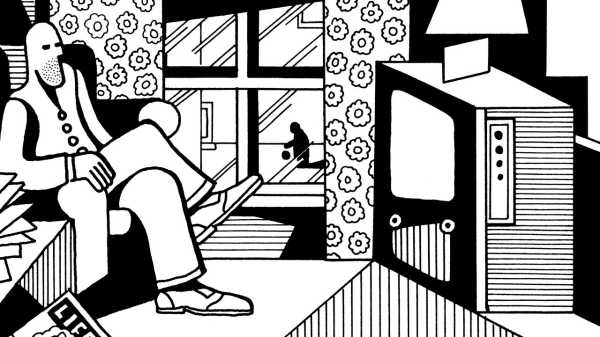
Panel 1
Panel 1 shows the narrator in relation to most of the objects focussed on in the rest of the page—a long shot of which the other panels are details.
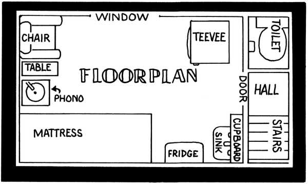
Panel 2
The floor plan is a further abstraction, situating the objects and space that serve to define the narrator.
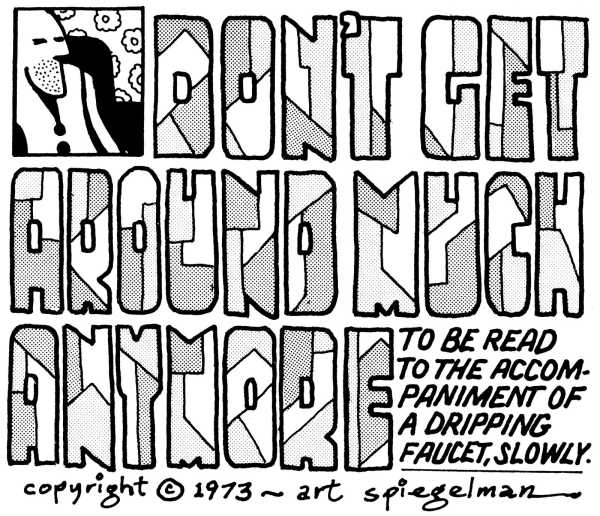
Panel 3
Panel 3, the title, is from a Duke Ellington blues song. The lettering is based on a specimen in an obscure nineteen-twenties lettering book. The square shape of the letters, the initial difficulty in decoding them, the mechanical tone sheets, all reinforce the themes of the strip. The detail of the narrator’s face is redrawn from the panel above in a small box almost the same size as the letters, and can function as the word “I.”
Many parallels are made between comics and film. (Both are popular art forms that synthesize other media, both are children of late-nineteenth-century technology, etc.) The differences between them must be respected, but I have occasionally regretted that, unlike film, comics have no soundtrack. Referring to the Ellington song is a step toward providing a mental soundtrack; asking for a dripping faucet as accompanist is an even more emphatic one. The dripping-faucet line is meant to be both taken seriously, yet also function as a self-conscious joke about my avant-garde aspirations.
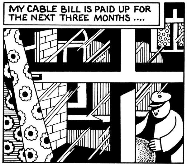
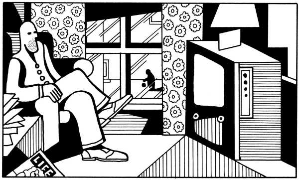
Panel 4
Panel 4, referring to cable television, is a closeup of the space between the narrator and the television in Panel 1. The bars of the window create subdivided panels.
Panel 5
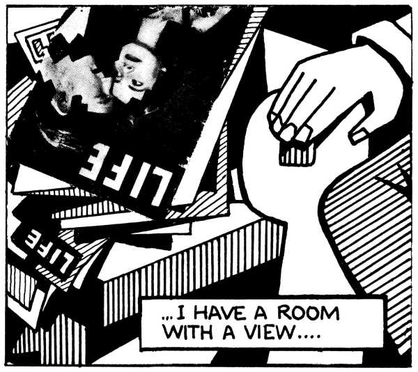
The text in Panel 5 is out of synch with the visual. It more directly refers to the picture in the previous panel pulling the reader’s eye back, or at least making one mentally connect the two panels. (This device—disengaging the picture from the text it illustrates—is a reaction to the many unsophisticated comic strips in which the picture is little more than an illustration of the text above it.) The figures on the collaged Life cover have been squared off to satisfy visual harmony and a personal penchant for graffiti. The collage impulse, a tactic borrowed from Cubism, is fundamental to the strip’s pervasive references to media as extensors of experience.
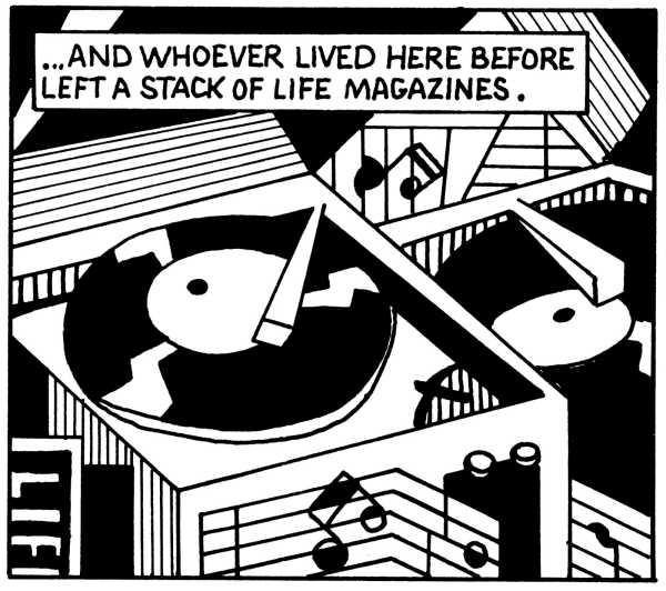
Panel 6
In Panel 6, once again the text appears to be out of synch, referring the reader back to the Life magazines depicted in the previous panel—although the Life magazine logo in the lower left leaves an ambiguity. The double-image record player sets up a back-and-forth eye movement within the panel, in an attempt to create a visual equivalent to the sound of a skipping record. (More on this later.) Now that a new pattern has been established—a block of text appearing one panel after the picture it describes—it is my obligation to rupture the pattern. Therefore, Panel 7.
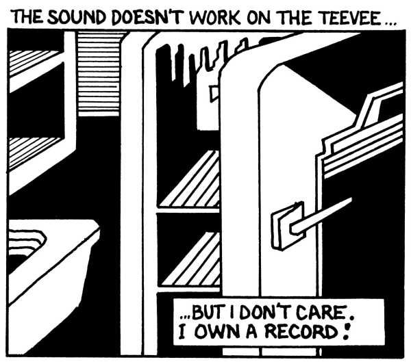
Panel 7
The text at the top refers to the television in Panel 8, while the text in Panel 8 once again refers back to Panel 7. The text at the bottom of Panel 7 brings one back again to the record of Panel 6. The cupboard in the upper left of Panel 7 is empty.
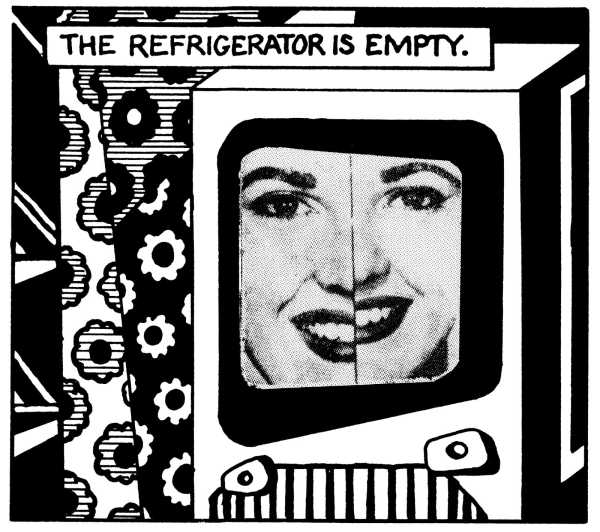
Panel 8
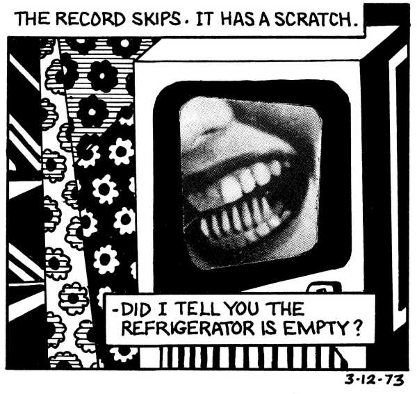
The laterally mismatched face on the TV in Panel 8 was found, as is, in a Life magazine ad pointing out the virtues of a larger picture tube. I am amused by the connection between her vacuously smiling face and the line “The refrigerator is empty.”
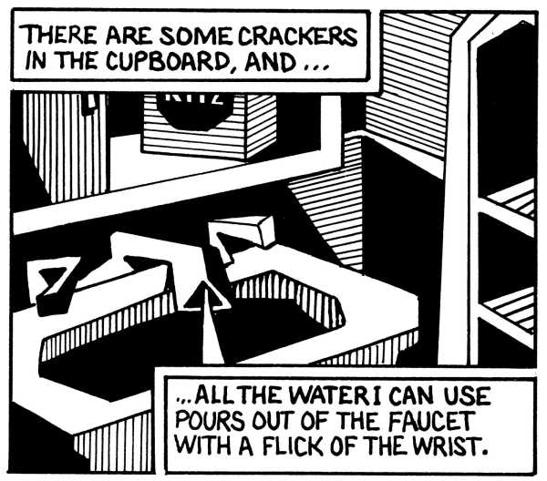
Panel 9
In Panel 9, for the first time, the words and picture are firmly connected. The upper box of text refers to the crackers and cupboard boxed directly beneath. Note that the cupboard now has a box of crackers, probably Ritz. The water pours onto the text box describing the faucet.

Panel 10
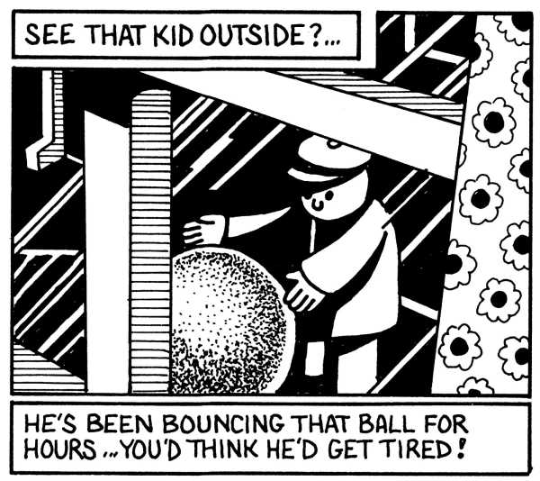
In Panel 10, text and image are again unmoored. The image is a return to Panel 4. The text in Panel 11 directs one’s attention to both Panels 10 and 11. The phrase “He’s been bouncing that ball for hours” gives duration to the action of the strip—it has been hours since the reader first encountered the kid at the beginning of the page. Our narrator has been stationary for quite a while. The closest thing to an event in the strip is the kid bouncing his ball, the roundest object in the strip, the one most emphatically represented as alive or in motion. It exists outside the narrator’s room.
Panel 11
By keeping the two images almost identical in Panels 10 and 11, the eye—always scanning for differences—is focussed on the “movement” of the ball. The back-and-forth motion already established in the strip makes the ball bounce repeatedly (to the accompaniment of a dripping faucet, slowly).
Panel 12
Panel 13
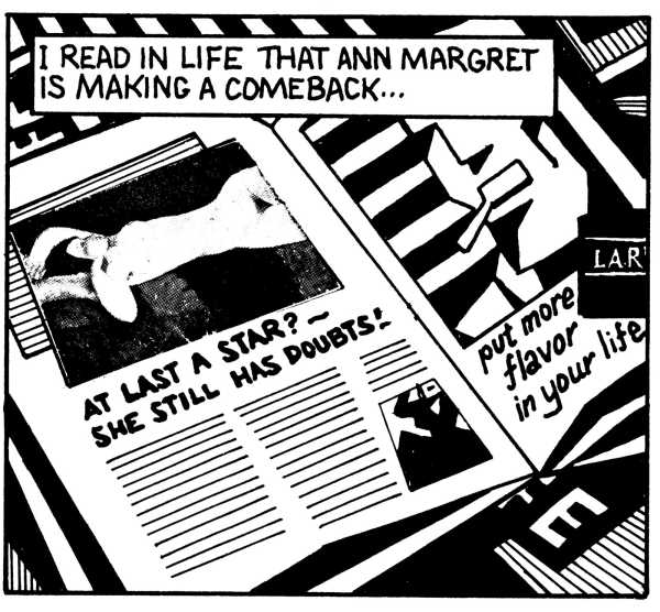
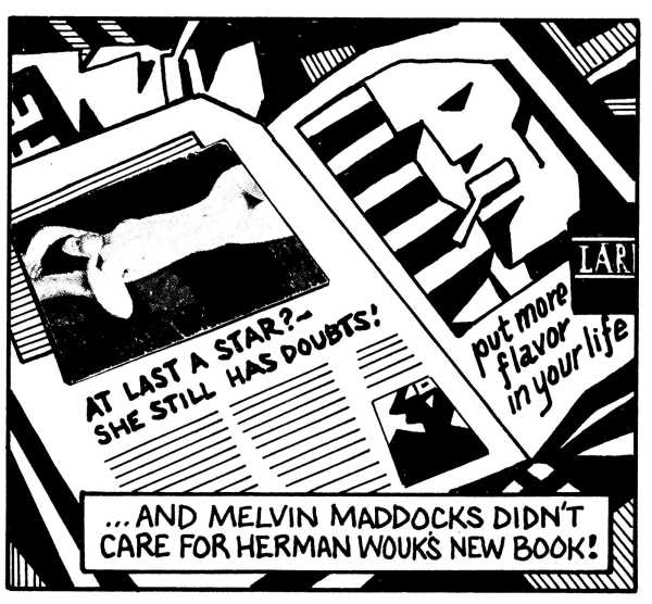
The repetition of the image in the next two panels provides counterpoint to all this activity. The Modigliani print used to illustrate the Ann-Margret article also comes from a Life magazine ad. At the top of Panel 13, the man from the Lark ad is placed on the cover of Life . . . to put more flavor in it.
Panel 14
The teeth in the last panel provide a startling contrast with the stylized teeth of the Lark man. The middle row of teeth, incidentally, is a toothbrush. The text and image both are means of making the strip swallow its own tail; sending one back again—with a grin or a grimace—to earlier panels, to find more than was made available on first reading . . . or in this article. Buy my book. ♦
This is drawn from “Breakdowns: Portrait of the Artist as a Young %@&*!”
Sourse: newyorker.com