Alexandria Ocasio-Cortez’s congressional campaign began as a moonshot. She’s a 28-year-old Latina from a working-class family. She’s running on a far-left platform of Medicare-for-all, abolishing ICE, strict gun control, housing as a human right, banning private prisons, and raising the minimum wage. “Women like me weren’t supposed to run for office,” she says in her viral campaign video.
Yet she beat 10-term incumbent Joe Crowley in New York’s Democratic primary 57 percent to 42 percent last week, all but securing her election in this reliably blue district. While she’s a vocal candidate with progressive ideals, she has an equally communicative, but silent, tool at her side: her visual brand.
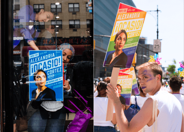
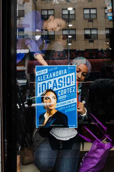
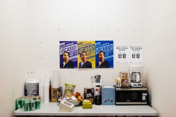
On the streets of New York’s 14th Congressional District, which includes parts of eastern Bronx and northern Queens, you might spot vibrant yellow campaign posters printed with a portrait of Ocasio-Cortez with her last name bookended by Spanish exclamation points, and calls to action in bold type, set at an attention-grabbing angle.

Ocasio-Cortez’s platform is unabashedly far left, and her branding is equally radical. In comparison, Crowley’s plain, inoffensive posters — surprise! They were red, white, and blue — signal the Democratic Party’s centrist, safe approach. Between the two, something as elementary as campaign posters has become an analogy of infighting on the left. As Democrats try to flip the house in the 2018 midterms, the party may need to decide which brand will serve them best.
Creating a bold style for a new candidate
After Ocasio-Cortez began her campaign, she hired Tandem, a New York-based creative firm, to design her campaign’s branding. She’s close friends with the firm’s co-founders, Scott Starrett and Shaun Gillen, who also designed for two new progressive political groups Justice Democrats and the Brand New Congress.
Tandem designer Maria Arenas joined Starrett to work on the campaign. Arenas, a 24-year-old woman of color, had never designed for a political campaign, so she said she came into the project with no preconceptions of what Ocasio-Cortez’s should look like, aside from knowing it had to be true to the candidate.
“Alexandria is a candidate with a revolutionary spirit,” Arenas says. “Voters heard it when she spoke. The branding is a reflection of her, which made it successful.”

Political branding tends to lean red, white, and blue. But Ocasio-Cortez requested that purple be a part of her branding since it represents red and blue coming together and is the color of the Brand New Congress. Tandem also used nontraditional yellow to associate positivity with Ocasio-Cortez’s campaign. Blue is the third official color, which is the Democrat’s traditional hue.
Ocasio-Cortez, a democratic socialist, ran a grassroots campaign focused on turning out young people and people of color — two groups traditional campaigns overlook since their turnout is often low for midterm elections and even lower for the primaries.
NY-14’s population is 49 percent Hispanic. Half of the residents in the district are immigrants and 70 percent are people of color. Steven Romalewski, from the Center for Urban Research at the City University of New York Graduate Center, found that Ocasio-Cortez won, in part, with strong Latino support, but her largest margins of support were in Astoria and Sunnyside, neighborhoods with higher white populations and where millennials are moving.
Arenas, Starrett, and the Tandem team looked to revolutionary posters and visuals from the past to inspire Ocasio-Cortez’s branding — particularly those of Cesar Chavez and Dolores Huerta, Latino labor activists and co-founders of the United Farm Workers in the 1960s — and union badges.
“That was the closest representation to a populist, social-minded, justice-inclined, inspirational campaign that was about positivity and taking back the power,” Starrett says.
The design process began with the posters and printed material. Since NY-14 has a large Spanish-speaking population, the designers knew the posters would need to be bilingual, which informed how they conceived of her logo. Placing exclamation points around her last name created a sense of excitement and embedded Spanish into her campaign’s DNA.
“You often see a second language slapped on [political material] without much thought,” Arenas says. “We took that opportunity to try something that would work with two languages.”
Additionally, the points of the exclamation points are stars, not circles — a nod to the Puerto Rican flag and Ocasio-Cortez’s heritage.
“The demographics in her district aren’t predominately white,” Starrett adds, “That gave us a lot of leeway to put the material on even ground. The majority of the audience we’re talking to is Spanish-speaking. So why would we put them in the back seat?”
For outsider candidates, being unique pays off
In politics, image is key. In an increasingly visual world, candidates are looking to design to help them better communicate who they are and what they stand for. Barack Obama’s presidential campaign was widely celebrated for using tools from corporate branding — a recognizable logo, a consistent identity system — throughout his 2008 presidential bid.
Hillary Clinton took the same approach during her 2016 campaign, but with opposite effects; critics said it was too corporate and impersonal even though it adhered to the same principles as Obama. Meanwhile Trump’s “poorly designed” hats were an effective branding tool, challenging the notion that adhering to commonly held “good design” principles translates to political success.
Some politicians are hesitant to come off as too slick in their branding, or too corporate.
“The response to Alexandria’s campaign shows that graphic design and branding has a place in an area where people are scared of it being ‘marketing,’” Arenas says. “It’s a misconception that having a polished brand is a bad thing. Having good design doesn’t mean you’re trying to trick people; good design means they’re communicating their message correctly and amplifying who there are.”

Lindsay Ballant, an adjunct faculty member at the Maryland Institute College of Art and art director of the magazine the Baffler, argues that the success of Ocasio-Cortez’s branding is that it doubles down on who she is and the strength she’s capable of as a lawmaker.
Through its style, her branding clearly conveyed her campaign’s “fearlessness in taking on a comfy establishment figure,” Ballant said. “The design just had to enhance that and, frankly, make sure it didn’t get in the way.”
It’s impossible to pin a campaign’s success solely on its branding. But in Ocasio-Cortez’s case it did the job it needed to: get her noticed.

Starrett wants Ocasio-Cortez’s branding to inspire more ambitious political graphic design.
“Politicians are tough egotistical beasts when it comes to branding. I’ve seen amazing identities chewed down by calls to add more stripes and stars and flags,” he says.
“Being a homogenous or safe candidate, visually, really communicates something to the public. It makes sense for conservatives to have conservative identities. Why do progressives have identities exactly the same as their colleagues across the aisle? It fits into a coding system of, ‘Don’t look here. You know the drill.’ Hopefully more people will start to grab attention and communicate who that candidate is and inform people in a more approachable and inspiring way.”
Sourse: vox.com


